
Trust — Breaking or Building it Through Design
November 11, 2021
Back in 1999, Jakob Nielsen wrote the article “Trust or Bust: Communicating Trustworthiness in Web Design” where he talked about how the Web was turning into a low-trust society and disregarded customers who were traded like sheep. We could expect that more than 20 years later this lack of trust Nielsen reflected on would no longer be an issue. But it’s the exact opposite.
Trust is more valuable now than ever. 68% say trusting a brand they buy or use is more important today than in the past (Edelman, 2019). We live in an ever-growing digitalised world, where we increasingly interact and transact online. At the same time we constantly crave for trust-based interactions in digital environments. Questions like “Will the personal data I provide here be misused?”, “ Will my email be used to spam me incessantly?” or “Do I really want to share my bank details to a website I’ve never heard about?” have certainly come to our mind more than once.
The problem: trust is in crisis
“Consumers, citizens, and corporate buyers are feeling a sweeping, protective skepticism that undermines the delivery of information, products, and services in every sector of the economy. Can you blame them? Your audience has endured failures of leadership, inconsistent messaging, and deceptive practices from brands they thought they knew, in the halls of governments, and from public figures who used to offer a definitive perspective on the day’s news. Cynicism takes root when people don’t know who to trust and decide not to believe anything.”
Margot Bloomstein in Trustworthy: How the Smartest Brands Beat Cynicism and Bridge the Trust Gap
People don’t know who and what to believe in anymore. Over the past few years countless scandals involving tech companies, governments, the media, and other large corporations have contributed to a significant loss of the public’s trust. Facebook-Cambridge Analytica (2018), Volkswagen Emissions (2015); Fake news; Boeing 737 MAX (2020), and home assistants eavesdropping, just to name a few. Also the COVID-19 outbreak and the associated misinformation epidemic has impacted people’s trust. No wonder people have concerns about data security, information credibility, misinformation, and so on.
In order to succeed, companies have the challenge to prove their trustworthiness. 81% of consumers said that they need to be able to trust the brand to buy from them (Edelman, 2019).
What is trust in design?
Trust can be defined as the belief that someone or something is reliable, good, honest and effective. That’s what users expect from the websites and apps they browse and use every day and that’s what designers need to design for.
Trust is vital when trying to build a long-lasting relationship with users. It’s something that goes beyond their interaction with a single channel (like the company’s website), but should be reflected on the entire customer journey (which includes customer service, in-store experience, social media, etc.). Often the website or app is the first touchpoint of a user with the company. It’s what’s going to define their first impression of that company.
Design plays an important role here as companies rely on it to communicate with their users. Trust is made of the number of elements included in a design. Every touch-point of a brand should be designed to motivate trust and to give users the power to make their own decisions.
A company that establishes truth and presents itself as credible is more likely to turn visitors into customers. Trust is a key differentiator from competitors.
What happens when users distrust?
When engaging with a brand users expect honest dealings, reliability, that the brand will deliver on its promise in every interaction, and not being taken advantage of when vulnerable. If this doesn’t happen, trust ends up broken, and the businesses consequences are undeniable.
If they don’t trust the brand they will abandon purchase and subscription processes, avoid providing their personal information at all cost, go to other websites to verify information, be suspicious about company claims and intentions, share with their family and friends their not-so-good experience.
Breaking trust with dark patterns
“Dark Patterns are tricks used in websites and apps that make you do things you didn’t mean to, like buying or signing up for something.”
This is the definition we can find at darkpatterns.org. This portal was created in 2010 by Harry Brignull, who first coined the term, and collects several examples of dark patterns found in real websites and apps. His goal was to raise awareness and shame companies who use these tricks. He incentivises people to share examples of the dark patterns they come across with on Twitter, believing this to be a way to expose companies who do it and put some pressure to stop using dark patterns.
There are many different types of dark patterns. It might be a subscribe button that’s much larger than an opt-out button or a product you didn’t select added to your shopping cart. What do they all have in common? They are all designed to benefit the company rather than making the user’s experience easy and enjoyable.
Manipulative cookie banners — If only they were real cookies…
As soon as you enter a website you’re greeted with a (most of the times annoying) pop-up called the cookie banner. It exists so you can give your consent for websites to retain information about you between browsing sessions. They normally offer you a choice — accept only the essential cookies for you to browse the website and use its features (normally called “strictly necessary cookies”) or accept them all, including marketing cookies used to track your online activity and and sell them on to advertisers so they can target adds specifically for you.
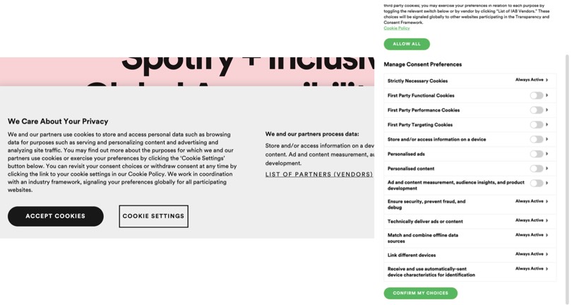
Cookie banner and cookie settings examples from Spotify’s website
In the example above you can clearly see how the “Accept Cookies” button is highlighted (in some websites is also larger), attracting your cursor to click there as soon as you enter the website. On the other hand, the “Cookie Settings” button is far less prominent. It’s an option that implies more time-consuming clicks and loads of confusing preferences to manage (as you see on the right) which has the clear intent to scare you away from the option that can actually protect your privacy.
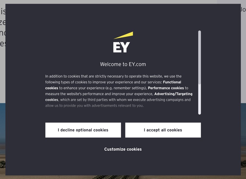
Cookie banner example from EY website
This clearly opposes to what we see in this example from EY. Both the “I decline optional cookies” and “I accept all cookies” buttons are visually presented in the same way.
If you try the Cookie Consent Speed-Run you’ll see how hard it is to click the right button when trying to obtain our basic privacy rights in cookie banners.
Trick questions — You don’t want to accept it but we’ll make sure you do
This type of dark pattern takes advantage of language artifices, such as intricate wording and double negative, to confuse users and make them give an answer they didn’t intend. When glanced upon quickly the question appears to ask one thing, but if you read it carefully, it asks something entirely different. They take advantage of users’ tendency to skim through web pages instead of reading every word.
The example below presents two checkboxes — the first means “opt out”, the second “opt-in”. Since the first means “opt-out” users will tend to think the second second box means the same. However, if they select it they are giving their consent to receive marketing emails from third party organisations.
Source: darkpatterns.org
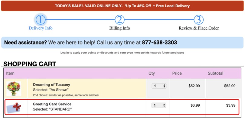
Sneak into basket — Dear customer, here’s another item for you to pay
When shopping online did you ever notice an item unexpectedly being added into your shopping cart? That’s just another dark pattern tricking you into purchasing more than you intended to do.
Here we can see an example from avasflowers.net which includes a greeting card priced $3.99 in the shopping cart, despite requesting no greeting cards.
Source: Dark Patterns at Scale: Findings from a Crawl of 11K Shopping Websites
Roach motel — Where are you going? Not so fast!
We can also refer to this dark pattern as “Hard to Cancel”. It’s when cancelling a service is more difficult than signing up for it.
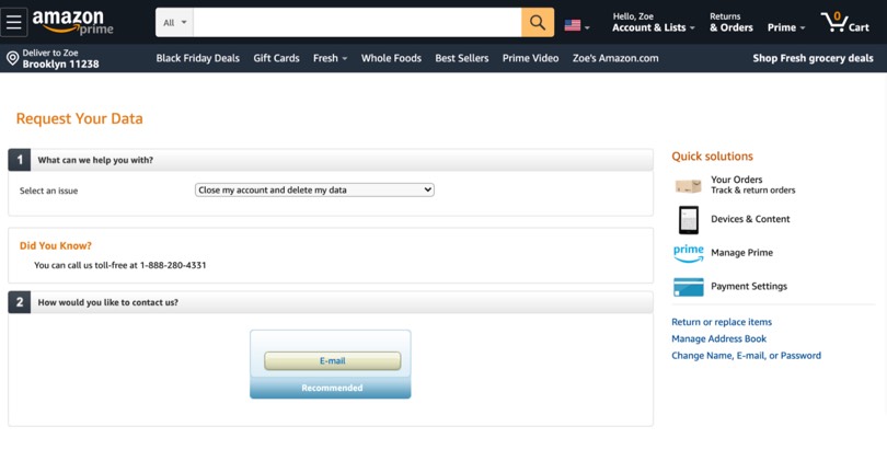
In the end, you come to the conclusion that you can’t even delete the account yourself. They have to be the ones who do it.
A widely-known example is Amazon. If you want to close your account you’ll basically have to go through a maze of steps. It’s a total of 8 steps which doesn’t compare to the few steps it takes to set up the account. The reason is obvious: their main goal is to keep you as a customer so why making it easy for you to leave? Luckily you’ll just give up halfway through the process.
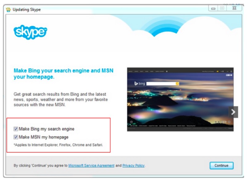
Misdirection — Go with the big, flashy, more expensive option
When a design purposefully focuses your attention on one thing in order to distract your attention from another. It can be used to nudge users towards a more expensive option, distracting them from the standard, more affordable one.
In this example to update Skype, the “Continue” button is highlighted to stand out and make you click it to continue the update hoping most users won’t. read through everything and uncheck the already checked boxes.
Hidden costs — Here’s the delivery fee we’ve never mentioned before
This dark pattern happens when you get to the last step of the checkout process, and only then discover some unexpected charges like a delivery fee or taxes, for example.
Here we can see how proflowers.com adds a “Care & Handling” charge ($2.99) which is only disclosed on the last step of the checkout process.
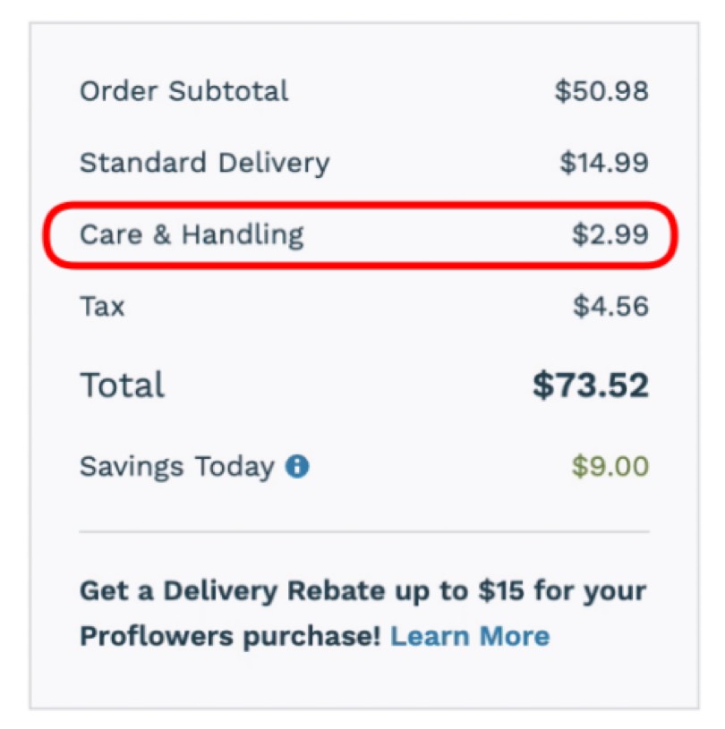
Source: Dark Patterns at Scale: Findings from a Crawl of 11K Shopping Websites
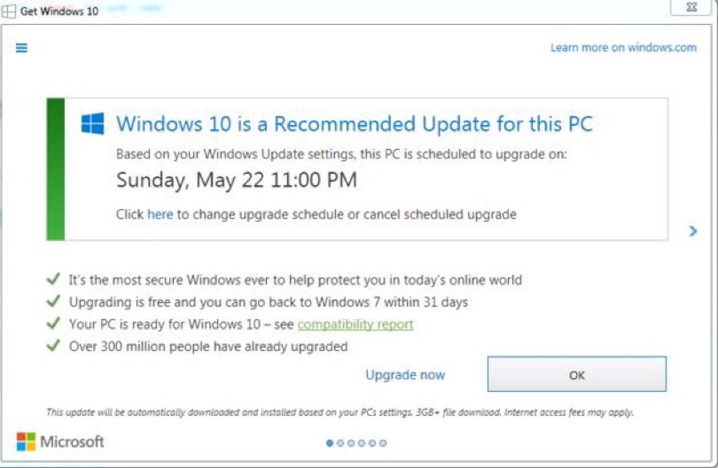
Bait and switch — Did you think it would do A? It’ll do B instead.
In this type of pattern, you take an action thinking it will have one outcome, but a different, undesirable thing happens instead.
One of the most famous examples of this dark pattern is Microsoft’s Windows 10 update. Normally, users would assume that to start the update they would have to click “OK” and if they were not interested they would simply press the “X” button. The problem was when Microsoft decided that clicking the top right button would mean “I want to upgrade my computer”.
Source: darkpatterns.org
Confirmshaming — Shame on you for not signing up!
These are design choices that make the user feel guilty by taking some action. They’re normally used to ask you for your email address in order to receive a newsletter or when you try to cancel a subscription to a service.
The acceptance link is normally bigger and more noticeable while the rejection link is much smaller, with a statement intended to make users feel bad about choosing that option. “I am a bad person”, “No thanks, I REALLY hate saving money” and “No thanks, I’ll have a microwave dinner tonight” are some examples.
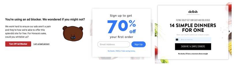
Confirmshaming examples
Disguised ads — Click here! Click here!
A download button that isn’t really the download button. A play button that turns out not to be the actual play button. These are examples of adverts that are disguised as other kinds of content or navigation, in order to get you to click on them.
In darkpatterns.org we can see the example bellow. Softpedia is a software download website which runs advertising that looks like a download button, tricking users into clicking there instead of the download they actually wanted to do.
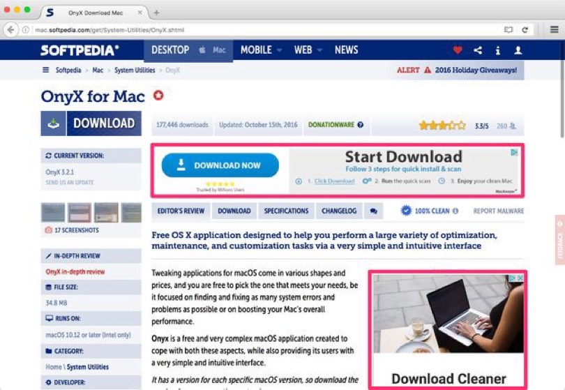
Source: darkpatterns.org
Forced continuity — Free trial period ended? Thank God you forgot to cancel it!
Most websites involving subscription services offer users a trial version by signing up and entering their credit card information.
The issue here is when that trial period ends and, since they have your account details, they automatically start charging you the weekly, monthly or yearly subscription. Most of the times people will just forget the free trial is ending and forget about cancelling. That’s exactly what they’re hoping to happen. They’re forcing your continuity with the service.
Below we can see how two different brands advertise their free trial. Spotify gives you Premium free for 1 month but you have to provide a payment method, and you’ll be charged 6.99€ if you don’t cancel it at the end of that month. Meanwhile, Sketch offers you a 30-day-free-trial but you don’t need to provide your credit card details. You won’t need to be worried about cancelling the subscription if you don’t plan on keep using their service.
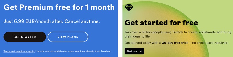
Free trial examples from Spotify and Sketch
Why are dark patterns unethical and erode user trust?
If user experience is about creating digital experiences that meet both the interests of users and businesses then we can clearly see how dark patterns go against that purpose as they benefit only one of the parts. They are a form of psychological manipulation nudging the users towards actions they probably wouldn’t have taken otherwise.
The thing with dark patterns is that they can backfire and end up having a negative impact on business. Long-lasting relationships with customers are based on good experiences and trust. If users notice you’re sneaking items into their shopping cart or charging the service subscription when the free trial ends without further notice or an easy way to cancel, they’re not likely to keep purchasing your products or services, let alone recommend you to their friends (aka prospect customers). A competitor who provides a much better experience will be just around the corner welcoming them in.
When the dark pattern practice has given origin to countless memes you no it can’t be good UX design.
How to build for trust?
We don’t trust a random stranger on the street the first minute we engage with them. The same happens with organisations. In a digital environment, organisations need to apply certain mechanisms that can help them design trustworthy digital products and services.
1. Design quality
The webpage or app must have a professional appearance. Both structure and navigation must be clear so that users can find the information they’re looking for as easy and quickly as possible. The more difficult it is to locate information on the website, the more likely consumers are to distrust the brand. The colour scheme must be appropriate and imagery related to the business.
Broken links, spelling mistakes, outdated references seriously compromise a website’s credibility and show a lack of attention. If users see a company doesn’t pay attention details in their website, they might get the idea that the company is not paying attention to other parts of the business as well.
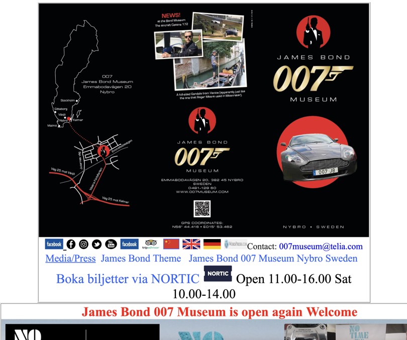
James Bond 007 Museum website
This an extreme example of what design quality doesn’t stand for. As much as you like 007 there’s no denying the website promoting its museum in Sweden is definitely not appealing. It’s one never-ending page, with no navigation menus to help find important information someone wanting to visit the museum might need (info about the museum and its exhibit, location, schedule and entrance fee, etc.), the font-style is outdated and not web-friendly, the layout is not consistent. The museum might be worth a visit, but its website certainly doesn’t.
2. Up-front disclosure
How many times did you add an item to the shopping cart and create an account (as it’s mandatory to proceed) just to find out the outrageous shipping costs? Pretty annoying, right?
This is something that doesn’t happen when brands reveal all order-related charges immediately rather than waiting until the user has placed an order to do it. Hiding the shipping costs until the last checkout step doesn’t mean customers won’t back down from ordering.
Up-front disclosure applies not only to shipping charges but to all aspects of customer relationship. Presenting the users all the information they need to know about the company, the product features, the service they are signing up for, the use of customer data (why it’s necessary and what is going to be used for), terms and conditions, additional fees and charges, return policy, guarantees, etc. will show them the brand is transparent and honest with its users.
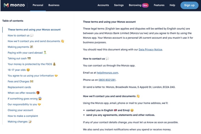
Monzo’s Terms & Conditions
Monzo, a digital British bank, presents their Terms & Conditions and Privacy Notice, documents normally filled with technical and legal jargon that most times people hardly understand, in a easy-to-understand language and even use emojis to make it more friendly. In their tone of voice guide they state “we use the language our audience uses, and make technical stuff as clear as we can”.
Keeping text as understandable as possible can help companies increase trust.
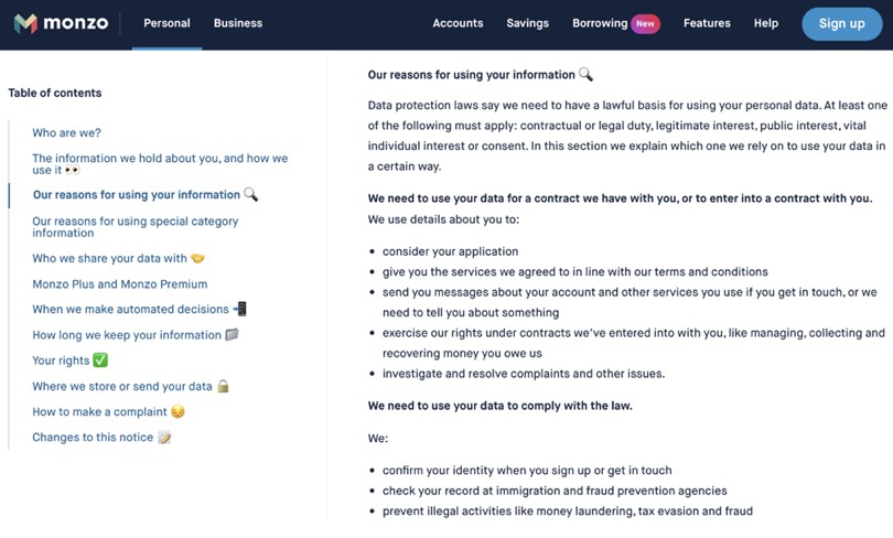
Monzo’s Privacy Notice
Customers are getting more demanding (specially Millennials and Gen Z) and they want to know as much as they can about a product or service before committing to any purchase or subscription. Providing the right amount of useful information shows you’re being transparent and honest to users.
Transparent Princing in Everlane’s website
The clothes’ retailer Everlane advocates what they call Radical Transparency. Their ethical approach focuses on finding the best factories around the world which guarantee fair wages, reasonable working hours and environments. When shopping for a Cashmere Polo besides standard selling information we normally see — price, size reviews, composition — we are informed about where is was made with a link to see more information about the factory. Their transparency steps up a notch when they reveal the true costs behind all of their products, including cost of materials, hardware, labor, duties, and transportation.
3. Consistency across channels
Design, colour scheme, fonts, language, tone of voice much be consistent throughout all the experiences you create — from your website to social media, landing pages, display ads and physical locations. Creating consistency across all channels improves users’ experience and brand image, creating a feeling of trust. If the experience shows any signs of inconsistency, users will question the brand’s credibility.
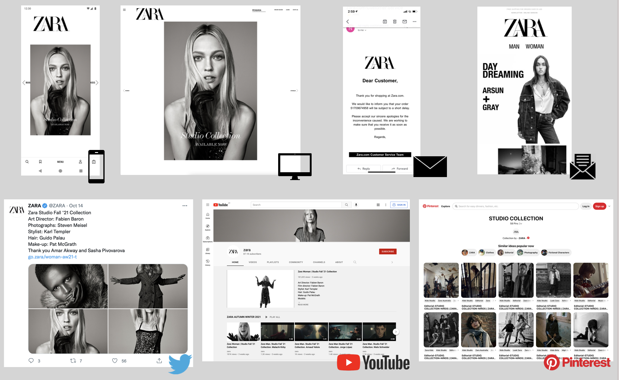
Zara, the Spanish apparel retailer, has the same look-and-feel across every channel — app, desktop website, emails, newsletter, and social media.
4. Comprehensive, correct and current content
All information the website presents must be relevant, accurate, up-to-date and unbiased. You should reveal all the information so that users don’t feel like you’re hiding something underneath. For example, an e-commerce website should have product photos of all products. It’s also important that users aren’t overwhelmed with excessive content.
5. Making it personal
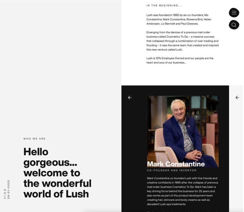
The “Who we are” page in Lush website presents the co-founders and talks about the company’s story.
In a world where most of people make transactions entirely online, a human touch can help to establish connections. People are more likely to trust someone who they identify with rather than an impersonal, faceless entity. Reducing strangeness is key to increase people’s willingness to trust.
People like to know who they are buying from or working with so including an “About Us” page to talk about who’s behind the brand, their workspace, the brand’s culture and story, etc. can help adding that personal touch.
6. Being easy to reach out
Users want to easily contact companies to provide feedback, ask questions, or to report a problem with a product or service. They also expect a prompt answer. Many websites now have fixed chat buttons on the bottom right of the screen and apps have in-app chat options. However, in many cases those chat options aren’t actually working. In practice they simply send an email. If they’re meant to streamline brand-customer communication, then they should work properly and guarantee there’s someone to provide an answer for most of the day.
7. Borrowing external trust
When we’re looking to buy a product from Amazon or selecting a restaurant for a date night dinner in TripAdvisor we often look at the reviews and rating sections. We’re actually looking for insight and advice to make the best choice. Although we don’t know who those 500 people are, we believe that if they’ve rated a product mostly with 4 and 5 starts then their transaction was trustworthy and fulfilled their expectations.
If potential users see testimonials of happy customers, they will believe it’s safe to trust the company as well. Besides, including customer reviews can act as proof that the brand is legitimate and trustworthy.
Mentioning who the organisation worked with, specially if they’re well-know brands, can really help to back up credibility. If there are any certifications available inside the organisation’s industry it’s important to get them. Being a certified company will show users and customers that an official, external entity attests that the product or service is legitimate.
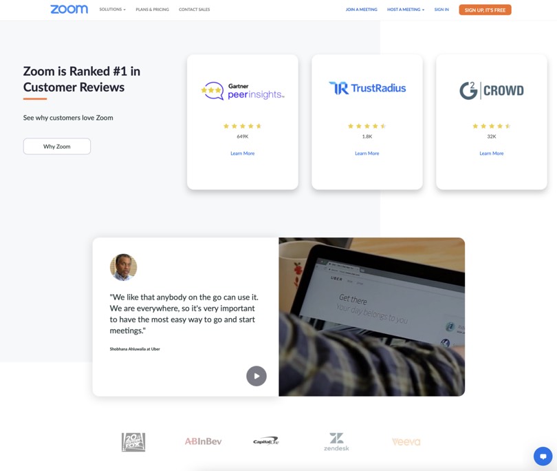
Zoom’s homepage presents their ratings in several customer reviews websites, testimonials from users, and companies that trust them.
Design for trust to build great products
Our relationship with friends, family, collegues, partner require above all trust. When you trust someone, you know you can rely on them, count on them, believe them. Trust is not only important in personal relationships. Companies must also build a relationship of trust with their users or customers. When people feel they can trust a company, they are more likely to buy their products, download their apps, subscribe their services. If nothing jeopardises their trust, higher are the changes of building a long-lasting relationship, one that makes people return to buy more products, keep using the app, keep paying the subscription. Also, they will likely advocate for the company, recommending it to friends and family.
Want to provide a trustworthy experience to your users?
Xperienz believes that a good design should be more than just eye-appealing, so we back up the design with solid research about the business and user base to design useful, easy-to-use, delightful and reliable products and services.
Tell me moreRelated Articles
-
Prompt-based — The birth of a new human-machine interaction model
The ways humans interact with technology has evolved significantly over the decades — and it’s still constantly evolving. The rise of Artificial Intelligence (AI) and natural language processing (NPL) has brought to light a new way of interaction — prompts.
-
A glimpse into the future — Here’s the UX design trends we expect to dominate 2024
Emerging technologies and tools constantly influence the way people use the Internet and interact with digital products. And as user behaviours and preferences evolve, designers must keep up with new tools and solutions to deliver interfaces and user experiences that cater the needs of an ever-demanding audience.
-
How can insurance companies make their digital products more accessible?
Millions of people who live with a disability struggle to access important information online because websites and apps are built with major content and technological barriers. And insurance websites are not an exception.
-
Barrier-free banking - From branches to mobile apps accessible for all
In the banking and financial industry, accessibility is about empowering everyone, including people with disabilities and the elderly, to enjoy bank's products, services and facilities, by making them convenient and easy to use.
-
Design for a better world - How working together and applying design approaches is improving people's lives
9 November is World Usability Day 2023. This year's theme is Collaboration and Cooperation, which intents to focus on how we can work together to create solutions, both globally and locally, to solve the world's biggest problems.
-
Be an Agent of Change - Check these resources to help you build more ethical designs
The role of today's designer goes far beyond simply creating beautiful interfaces and experiences. You can no longer design without considering the consequences of how what you're creating impacts individuals, society and the world.
-
E-commerce and Accessibility - Creating an inclusive online shopping experience
Now it’s the time for online stores to improve their website accessibility and ensure they offer an inclusive experience for everyone.
-
The future is today — How can we leverage AI to improve our UX Design work
AI has now become a big part of several areas of our lives, and UX Design is no exception. It’s actually becoming more and more applicable to the UX design process.
-
Accessibility Compliance App - by Xperienz. A useful tool when fixing accessibility errors
To simplify the presentation of the accessibility evaluation of websites, Xperienz has created the Accessibility Compliance App. We start by doing a content inventory in which we collect all the pages of the site. Then we evaluate each page and list all the aspects that need to be fixed.
-
What does the UX future hold? - Here's the UX Design trends we expect to dominate 2023
Businesses must stay up to date on emerging user experience and interface trends so we've selected 7 top trends that are already making, and will certainly continue to make, an impact on website and app development.
-
Raising Awareness for Web Accessibility [Infographic] — International Day of Persons with Disabilities
Last December 3 we celebrated the International Day of Persons with Disabilities. To help promote a more accessible Web we’ve put together an easy-to-digest infographic about Web Accessibility.
-
Why hiring external UX services even when you have an in-house UX team?
Even if you have an in-house UX design team, there might be times when additional resources and professional know-how can be useful. Bringing in an external UX team might be exactly what you need for your company to excel in all projects.
-
Health and UX: when design has a life-saving potential
A good experience with healthcare technology and services, that is both useful, accessible and reliable, can make a huge different in improving peoples’ well-being, as well as the work of healthcare professionals.
-
Trust — Breaking or Building it Through Design
Trust is more valuable now than ever. 68% say trusting a brand they buy or use is more important today than in the past (Edelman, 2019). We live in an ever-growing digitalised world, where we increasingly interact and transact online. At the same time we constantly crave for trust-based interactions in digital environments. Questions like "Will the personal data I provide here be misused?", " Will my email be used to spam me incessantly?" or "Do I really want to share my bank details to a website I've never heard about?" have certainly come to our mind more than once.
-
Creating accessible digital experiences
Accessibility is of major importance for organisations who deliver web products and tools. Accessibility issues can affect not only a website’s usability for people who have disabilities but also for those who don’t. By offering accessible products, organisations will show they are inclusive, reach a wider market, be legally compliant, and offer a better user experience. For everyone.
-
"You're on Mute" - Lessons Learned After a Year of Conducting Remote User Research
After more than one year of engaging with users remotely, we want to reflect on the pitfalls of remote user research, share some of the lessons we learned and reflect on what’s going to be “the next normal” after Covid’s impact.
-
Quick & Dirty User Research
Tight timescales and budgets are no excuses to ditch user research altogether, specially when we all know it’s essential to make sure you deliver easy-to-use products. Quick and dirty research is a great way to get user insights fast and on a budget.
-
How bad metrics are hurting your business and your users’ experience
Businesses are deceiving themselves and annoying their customers as a consequence. They do so when they apply biased surveys only expecting to confirm what they want to hear.
-
UX Writing — Create better experiences with better content
Imagine a website or an app with no words. If it wasn’t for the logo, would you be able tell what this page is about? Would you know which button to click? Where navigation would take you? What you’re supposed to write in the search bar? No matter how good-looking an interface is, without words users will simply not be able to accomplish any tasks in it.
-
10 Bad User Research Practices You Will Want to Avoid
Some might think user research is as simple as watching people perform a few tasks on a website or asking them a few questions, but user research is definitely not walk in the park. Let’s go through some of the mistakes that can arise when planning and conducting research.
-
Responsive Illustrations
Can the same illustration be used the same way on a desktop screen, on a tablet or on a smartphone? How is it possible to make them look great on every screen without losing quality or the idea the brand is trying to convey?
-
UXLx Masters — Wrap-up
From 10 to 13 February attendees from 25 countries and 14 world-renowned UX experts joined online for 3 days of learning. The programme included 12 live masterclasses, 2 keynotes, 2 live podcasts, and more.
-
The Design Role in Digital Transformation
As the world keeps evolving and digital becomes more crucial to our everyday life, companies are feeling pressured to keep up and level up their game.
-
Remote UX Research — our selection of the best online tools to conduct it
As a company that focus on UX research and design, we gathered some of the best tools to conduct remote research and combined them, with our personal knowledge, in this article.
-
Why We Need Parametric UI Design Tools
In Design, parametric refers to a process based on algorithmic thinking that uses parameters and their interrelations to define a geometric form (which can be buttons, containers, panels, etc.).